[responsivevoice_button rate=”1″ pitch=”1.2″ volume=”0.8″ voice=”US English Female” buttontext=”Story in Audio”]
Samsung Galaxy Note 20 Ultra review: A love note to Note lovers
Our Samsung Galaxy Note 20 Ultra review found three clear reasons to make the jump to this new flagship phone: Mystic Bronze, laser autofocus, and the S Pen’s new 8ms latency. And if you’re looking for any reasons not to, well, there are plenty of those in this review too—namely, it’s gigantic, expensive, and not a huge upgrade over the S20 Ultra.
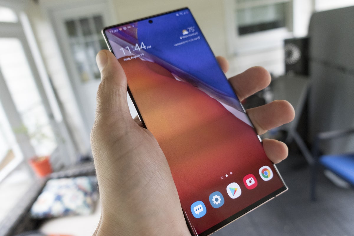 Michael Simon/IDG
The 6.9-inch screen on the Galaxy Note 20 Ultra definitely needs two hands to operate.
But if you’re a Note fan, you know exactly what you’re getting and you know you want it: the biggest, fastest, and most powerful Android phone you can buy. For everyone else, it’s not so simple.
Samsung’s flagships have gotten so good that reviews of them are all basically the same: Yes they have the best specs, but they’re also the most expensive (although the Note 20 Ultra actually costs $100 less than the S20 Ultra). The math is brutally clear: Even with trade-ins and carrier offers, you’re still going to be paying more for this phone than for any other Note that came before it.
There’s no doubt that you’re getting a lot for your money with the Note 20 Ultra. But Samsung has raised the bar so high, the best might not be worth the price of admission anymore.
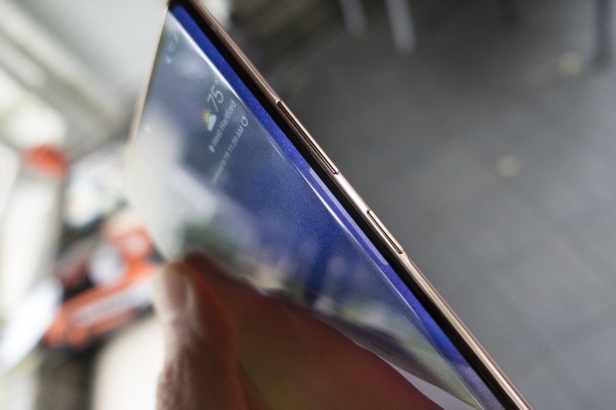 Michael Simon/IDG
Sorry, Bixby lovers, the dedicated button is gone for good.
Big, bold, bright, and beautiful
There’s no nice way to say it: The Note 20 Ultra is the most unwieldy phone I’ve ever used. Granted, it’s about 15 grams lighter than the S20 Ultra, three-quarters of a millimeter thinner, and only a couple of millimeters wider, but that phone was already at the upper limit of what my hands and pockets could handle. The extra width on the Note 20 Ultra, along with its very boxy shape, makes it feel incredibly uncomfortable to handle and carry.
The unwieldiness is due in no small part to the camera bump. You’ve seen it in photos, and it’s every bit as obtrusive as it looks. The Note 20 Ultra’s impressive thinness actually works against it here, making the bump feel much thicker by comparison. The size also means it’s tough to use when resting on a table. I even encountered some issues with charging pads. A case would help, but you wouldn’t want to use one.
 Michael Simon/IDG
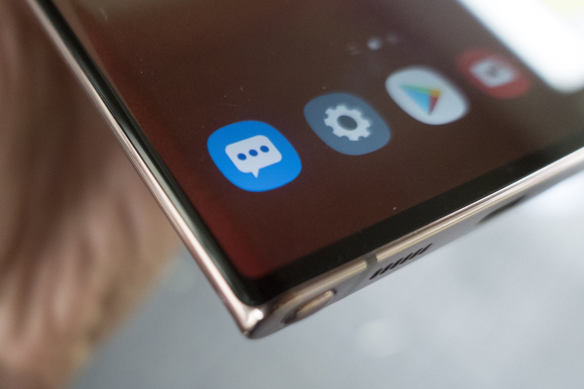
The bezels aren’t completely gone on the Note 20 Ultra, but they’re not very visible.
Why? Because the Note 20 Ultra is flat-out gorgeous. Samsung’s new colors are dubbed “Mystic,” and they give the Note a refinement and dignity that contrasts with the pop-culture vibe one gets from the S20 Ultra’s bright, iridescent “Cosmic” colorways.
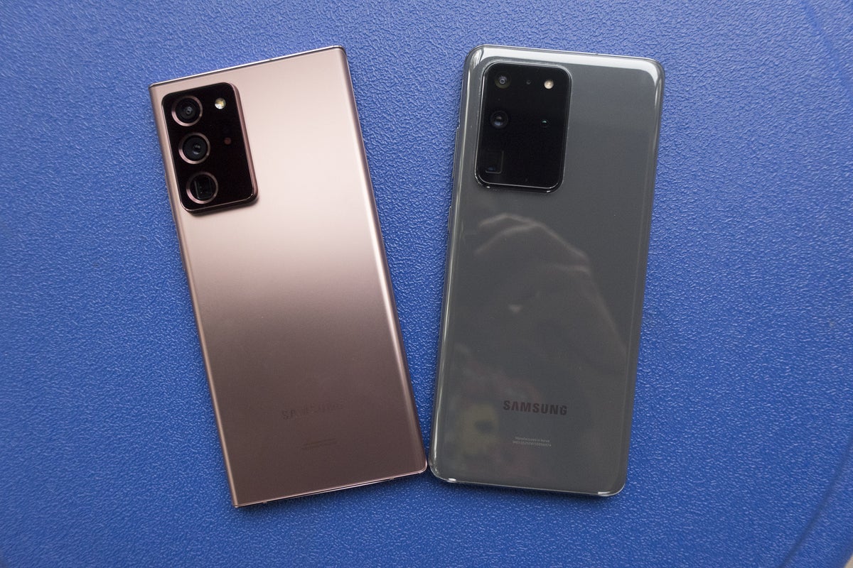
The Note 20 Ultra has a luscious matte finish that’s nicer than what I’ve seen on any Galaxy phone I’ve ever used. It doesn’t need to grow on you like the iPhone 11 Pro’s Midnight Green, or wait for the right light like the Note 10’s Aura Glow. It repels fingerprints like it was made of plastic, and it has a better grip than the glossy S20 does. The new bronze color’s matching, stainless-steel sides add a touch of sophistication, accentuated by the slivers of color that peek out above and below the display. You’d be nuts to get any other color and even more nuts to put a case on it, even a clear one.
 Michael Simon/IDG
The Note 20 Ultra’s matte finish is a massive improvement over the glossy S20 Ultra.
The front of the phone is equally fabulous. The bezels around the enormous 6.9-inch screen are about as thin as they can get without disappearing completely. The curved edges contrast nicely with the flat top and bottom.
Because it’s a Samsung flagship, it goes without saying that the display is big, bright, and breathtaking. But I’ll say it anyway. Samsung somehow manages top itself with each new flagship. If you go deep enough in the comparison with the S20 Ultra, you’ll see a more consistent white balance and a higher max brightness (a whopping 1,500 nits using adaptive brightness), but all you’ll notice are the vibrant colors and deep blacks.
The Galaxy Note 20 Ultra has the same 120Hz display that Samsung introduced with the S20, but here it has an adaptive refresh rate to conserve battery life. So if you’re reading an article, the rate will drop to 60Hz, but if you’re playing a game or watching a movie, it’ll increase to 120Hz. Unfortunately, you still need to drop the resolution to Full HD to use it the 120Hz setting, but it’s a small sacrifice. Once you try it out, you won’t want to go back.
Power to spare with some sparing parts
The Note 20 Ultra might not be a true “gamer” phone like the Asus ROG Phone 3 or the Lenovo Legion Duel, but it packs just as much of a punch. The Snapdragon 865+ combined with 12GB of LPDDR5 RAM produced the best scores I’ve ever seen on an Android phone:
Geekbench 5
Single: 966
Multi: 3,067
Compute: 3,652
PCMark Work 2.0: 12,298
So you’re getting a phone that’ll run everything at tip-top speed, including Microsoft’s new xCloud Xbox gaming service. I’m no gamer (my Candy Crush obsession notwithstanding), and my Minecraft Dungeons-loving son was too young to try out the preview with his account, but Xbox fans will surely be happy with the performance.
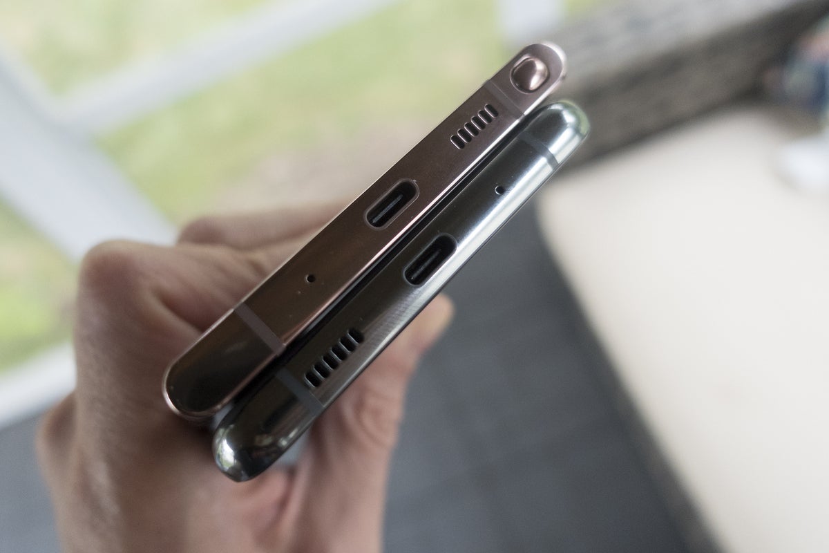 Michael Simon/IDG
The Galaxy Note 20 Ultra (top) is only about three-quarters of a millimeter thinner than the S20 Ultra, but the difference is noticeable.
You’ll also be able to download Fortnite without side-loading, an unexpected benefit of Epic’s recent war with Google and Apple. Because Samsung runs its own App Store and doesn’t have terms as strict as Apple’s for developers, the new Epic Store with discounted V-Bucks is available at a tap. My son reports that while the on-screen controls were a little confusing at first, gameplay on the Note 20 Ultra is “OP” (that means good), and he was able to snipe some sweats.
The Snapdragon 865+ chip gets a little hot, however. In Fortnite and other graphically intensive apps, the back of the phone became noticeably warm to the touch, often topping 100 degrees Fahrenheit during the heaviest loads (per an infrared thermometer). It might become an issue on hot days. That’s probably why the Asus ROG Phone 3 and Lenovo Legion Duel have specialized cooling systems.
One thing gamers will need to bring to the Note 20 is a pair of earbuds. Samsung has quietly decided to nix them as freebies from versions of the Note 20 sold in the United States. That probably won’t matter to most users who have long dumped the in-box buds for something better, but on a $1,300 phone, it feels a little stingy. As does the 128GB of storage, which is half of what the Note 10+ starts at.
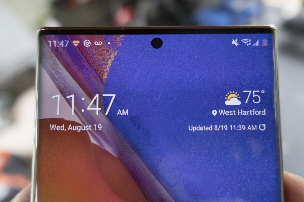 Michael Simon/IDG
The bezels are thin, the camera is centered, and the screen is gorgeous on the Note 20 Ultra.
Also a little on the skimpy side is the Note 20 Ultra’s 4,500mAh battery. While that’s bigger than what you’ll find on most phones, it’s smaller than the 5,000mAh battery in the S20 Ultra. But don’t worry: Your Note Ultra is still going to make it through the day, even with heavy users who want to keep 120Hz motion smoothness turned on.
Note 20 Ultra users will have to settle for second-best when it comes to battery life, however. In benchmarks, I got better than 12 hours with 120Hz turned off, but only around 9 hours with it on. My real-world experiences were similar: Even with the new adaptive refresh rate, the Note’s battery drained significantly faster when motion smoothing was on, which is just going to be a fact of life until it evolves. It’s the main reason why the iPhone 12 probably won’t include a ProMotion display—it kills battery life.
When you need to charge it, you’ll get 25W fast charging, but not the 45W charging on the Note 10+ and Galaxy S20 Ultra. It won’t make a huge difference—the Note 20 Ultra will still fill up in less than 90 minutes using the 25W charger—but it’s strange that Samsung removed support after just a year.
The camera bump also caused some issues with charging pads. More than once my phone didn’t charge because the camera lifted the phone up enough where the coils weren’t touching.
A mighty note-taker
Because this is a Galaxy Note phone, it has an S Pen on board, though it’s not like the styli of Note past. For one, it’s been moved to the left side of the device after living its whole past life on the right side.
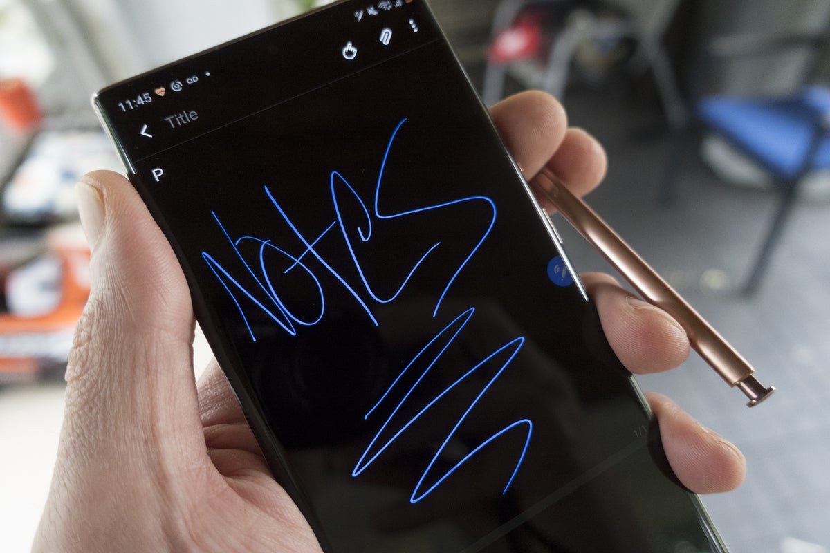 Michael Simon/IDG
You’ll want to take more notes with your Note 20 Ultra’s S Pen.
The placement isn’t the only thing that’s new. Samsung has accelerated the S Pen’s latency from 45ms to 8ms, which has a dramatic effect on writing and drawing. I never had an issue with the old pen’s performance, but the new S Pen feels as natural as writing on an actual piece of paper. That latency is the same as the Apple Pencil’s, and it makes a huge difference when taking notes, marking up documents, or just scribbling on the screen. It’s even better with the higher refresh rate. Samsung’s Notes app has been upgraded as well, with better handwriting support and annotated audio. I suspect you’ll be using your Note to take notes more often than with previous Notes.
The rest of the S Pen’s tricks aren’t nearly as impressive. Samsung turned its stylus into a Bluetooth remote with the Note 9 and added app gestures last year. Now the Note has even more “air actions” that let you control all aspects of the phone with back, recents, home, and screenshot gestures. I could somewhat see the appeal of using the S Pen as a remote for the Camera or Gallery, but the use case for the new air actions is extremely limited.
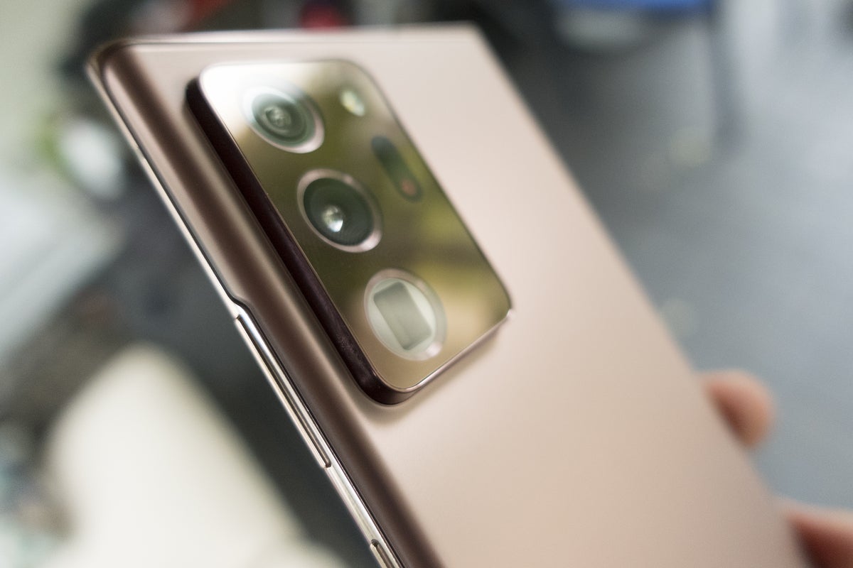 Michael Simon/IDG
The camera bump on the Note 20 Ultra is very bumpy.
And that’s if you can get them to work. While I was able to complete the handy tutorial that forces you practice each of the new gestures, getting them to work while using the phone wasn’t so simple. I often triggered the wrong gesture or none at all.
I struggled to find a reason to use them. Even when I was using the S Pen, it was just as easy to tap the phone than wave my hand to go back a screen or switch apps.
The new S Pen is joined by a new version of One UI (2.5) that brings minor camera and interface tweaks, as Samsung continues to refine one of the best Android skins this side of the Pixel. Samsung has specifically designed One UI to be friendlier to giant phones. The menus, navigation, and layout all make the Note 20 a little easier to handle. You’ll still need two hands, but One UI is a pleasure to use.
A more reserved, more refined camera
The Galaxy Note 20 Ultra has a camera system rivaling that of any smartphone out there, but it’s not quite as extravagant as the S20 Ultra’s. That’s a good thing. The 100X Space Zoom that was plastered across the camera array on the S20 Ultra has been lowered to 50X, and the DepthVision lens has been replaced by laser autofocus.
 Michael Simon/IDG
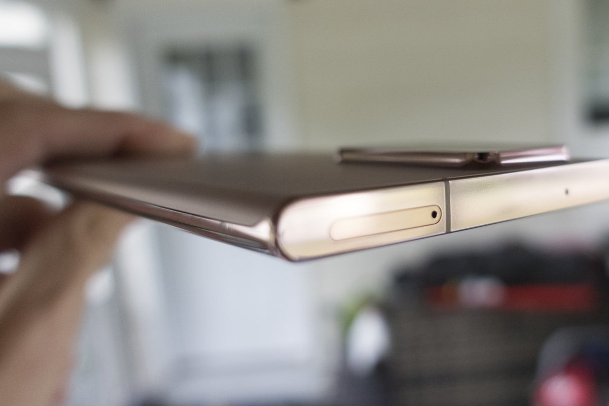
The Note 20 Ultra is impressively thin at 8.1mm, but the camera bump adds some girth.
Both changes serve the Note 20 Ultra well. While the 108MP lens is still largely unnecessary—I couldn’t tell the difference between 108MP pictures and 12MP “binned” images—the Note 20 Ultra is definitely Samsung’s best smartphone camera. It’s no coincidence that it’s also the least gimmicky, eschewing features like Dual Exposure on the Note 9 for the things that matter: improved night mode, lightning-fast focus, and realistic zoom.
 Michael Simon/IDG
The Galaxy Note 20 Ultra has impressive zoom, seen here (clockwise from top left) at 1X, 10X, 30X, and 50X.
The zoom has its limits. When pushed to 50X, the Note 20 Ultra still produces noisy shots. Drop to 30X and they’re useable, but 10X yields the best results. If I were in change of the Note 30’s camera, in fact, I’d make 30X the upper limit and work on perfecting it. Samsung’s zoom is its biggest advantage over Google and Apple (for now). Even with fewer megapixels in its telephoto lens (12MP vs 48MP on the S20 Ultra), the Note 20 Ultra takes better zoom shots.
 Michael Simon/IDG
Even without a dedicated time-of-flight sensor, the Note 20 Ultra (left) takes portraits that are as crisp as the S20 Ultra’s.
The other big improvement is with autofocus. Focusing was an issue with the Galaxy S20 Ultra that has never been satisfactorily resolved. For the new generation, Samsung added a laser autofocus sensor to the Note 20 Ultra. It makes a huge difference over the S20 Ultra and is a far more useful fourth lens than a macro or depth one. I’ve never used a phone that focused this quickly without needing to tap the screen, and it helps all aspects of the Note.
 Michael Simon/IDG
The Note 20 Ultra’s laser zoom is so fast and precise, the center of subjects are often too in focus, leaving blurry edges.
However, at times it works a little too well. When the foreground is similar to what’s behind it, the Note 20 occasionally locked onto the wrong part of the picture. Other cameras were smarter. When it got it right, photos often had an aggressive bokeh effect even without using Live Focus. In the photo of the flower above, for example, the back petals are out of focus. The same shot with the Pixel 4a has everything in focus.
Night mode also improves on the Note 20 Ultra, pulling it close to equal footing with the iPhone 11 and Pixel 4. Shadows and lowlights aren’t blown out as they are on other Galaxy phones. Pictures have less noise than on the S20 Ultra. It’s a great improvement and puts the Note 20 Ultra on firm footing with the night mode champ.
 Michael Simon/IDG
The Note 20 Ultra (left) takes sharper, more balanced, and less over-exposed photos in Night mode compared to the S20 Ultra. (It was very dark when I took these shots.)
Hands down, the Galaxy Note 20 Ultra is Samsung’s best camera phone. You’ll still get a healthy serving of Samsung’s trademark oversaturation, and the app is still a bit more confusing than it should be. But more often than not, you’re going to take your phone out of your pocket and snap a great pic with very little fuss, whether you’re far away or shrouded in darkness.
Should you buy a Galaxy Note 20 Ultra?
Nothing I write here is going to convince you about a Note 20 Ultra either way. If you have $1,300 to spend on a phone and want the very best of Android, you’ve probably already decided to order one. And if you’re a Note lover, it’s likely already on the way.
For everyone else, however, it’s a tough recommendation. It’s undeniably the best phone you can buy, but it’s also probably more screen and power than most people need. No matter how you slice it, $1,300 is a ton of money to pay for a phone, even one as beautiful as the Note 20 Ultra.


