[responsivevoice_button rate=”1″ pitch=”1.2″ volume=”0.8″ voice=”US English Female” buttontext=”Story in Audio”]
How iOS 14 stole features from Android—and made them so much better
On Monday Apple unveiled iOS 14—and if you’re an Android user, the “new” OS might have looked a little familiar.
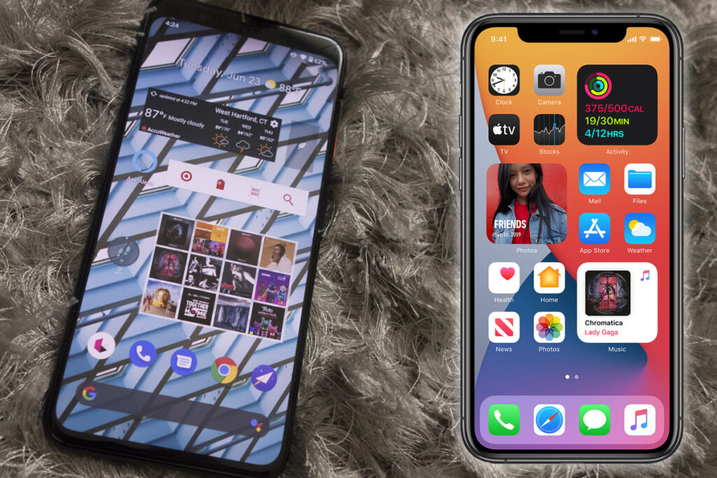
The latest upgrade to the iPhone operating system, due to release this fall, promises improvements including a new home screen, smarter navigation, faster apps, and a fresh coat of paint on everything. And it’s clear that many of the best features are inspired, influenced, or just plain swiped from Android, from the new default email and browser apps to the picture-in-picture for videos. You can plainly see the influence on the new compact view for Siri and incoming calls, cycling directions in Maps, even the new home screen widgets.
Apple’s marquee iOS features will be very familiar to anyone who’s used an Android phone—but also a whole lot different.
But as I watched Apple unveil the features during the slick and fast-paced keynote, I couldn’t help feeling a little envious. Apple has refined Android’s features to the point where they practically make Google’s version seem downright inferior. It’s not just Apple’s slick sales pitch—there are numerous iOS 14 features that I’ve used on Android for years. But they somehow still seem fresh and right at home on the iPhone.
Apple gets a lot of credit for breaking new ground, but the fact of the matter is it rarely does. What Apple does best is build things that work so well and feel so natural that whatever came before doesn’t matter. That talent is on full display in iOS 14.
A drawer by any other name
The most obvious feature borrowed from Android is the App Library. Similar in spirit to Android’s longstanding app drawer, it finally removes the need to keep every app you’ve downloaded on your home screen with no way to sort them automatically.
But instead of just moving them to a drawer, Apple has developed a novel feature that lets you hide home screen pages but still access your apps with a swipe. That’s similar to how Android works—apps are collected in the drawer but can also exist on your home screens for quick access—but the iOS 14 version lets you have it both ways.
Once you see the App Library in iOS 14, you’ll never look at the app drawer in Android in quite the same way.
Hiding apps from view on iOS is a long-overdue feature that Android has had for years, but it still feels new in iOS 14. On Android, you need to nuke every app when you want to clear out a home screen and start over if you change your mind. Apple’s App Library keeps your home screens organized as they were before, but lets you easily hide and unhide them. Even the App Library itself gets an upgrade over the app drawer, with smart suggestions and folders that spotlight your most commonly used apps.
Winning the widget war
Apple has also done a better job with iOS widgets. Android has had widgets on the home screen for as long as the iPhone has had a Lightning port, but very few of them are worth using, outside of the Google search bar and basic weather conditions. Third-party widgets are, to put it mildly, mostly garbage, and Google hasn’t done anything to advance the platform aside from a few Pixel-first widgets that are installed by default.
Apple even stole Android’s compacted assistant view.
But widgets in iOS 14 really do look good. They have a unified design that will extend to third-party apps. The sizes perfectly align with each other and the icon grid. They look like a natural part of the home screen. Most importantly, they accomplish their main task: to provide at-a-glance information that cuts down on the need to launch apps.
It’s the same old story: Android gets there first, but Apple gets it right. I can’t remember the last time I added a widget to my Android home screen. Unless it comes with the phone, like One UI’s weather widget or the Pixel’s search bar, they don’t add enough to the experience to bother. When I download iOS 14, however, one of the first things I’ll do is check out the app gallery and install a few of them.
A better Android
Those aren’t the only features that are clearly cribbed from Android. You can see the Android influence in App Clips, which are Apple’s version of Instant Apps, as well as the new compact interface for calls and Siri, the Translate app, PIP, choosing default email and browser apps, not to mention cycling directions and city guides. Even pinned conversations in Messages is a feature on Galaxy phones.
Five bucks says Google changes the widget interface in Android 12.
But in nearly every instance, the implementation is smarter on iOS. Apple may take longer to get there, but more often than not, Apple sets the curve for features and designs on phones, and it’s up to Google to ignore it to tweak their own system. We’ve already seen it with notches, gesture navigation and face unlock. I’m willing to bet Android 12 or 13 will have something very similar to the App Library inside the drawer.
Apple might not be the first, but it usually has the last word. That’s far more important in the long run.
